Getting Started
My first URCap Guide
Before you start
Make sure you have followed the steps during Setup. This should set you up with the running DevContainer inside VSCode or IntelliJ.
Important
For the best experience it is recommended that you already have some knowledge about Angular, TypeScript, HTML, CSS, URScript and Robot programming, but even without these skills you should be able to follow this guide and have your first URCap running in the simulator.
Goal of this Guide
This guide should help you to understand the basic concept of URCap development with the PolyScope X SDK. Within this project you will create a simple URCap that allows to turn on a digital output for a certain amount of time. From the program node the user will define: how long the digital output will turn True and which output should light up. Therefore, the program node will contain two controls for these inputs. The generated URScript Code should then perform the desired action. The URCap will be named “LightUp”.
Note
As we progress through this guide, we will be iterating over the code examples throughout the section. This iterative process is designed to enhance your understanding and application of the concepts. However, due to this iterative approach, the code snippets will differ from the full code provided at the end of the section.
The finished ProgramNode should look like this:

Create New URCap Project
First you are going to create a new URCap Project.
All commands provided in this guide should be typed into the Terminal of your IDE.
Bring up your Terminal with CTRL + J or ⌘ + J
Bring up your Terminal with ALT + F12
Create new URCap with:
./newurcap.sh
This will open a new Dialog in the Terminal to define your URCap Project. The first prompt will ask if it should include a Web Contribution (frontend). This is needed as we want to have a UI ( User Interface) that controls the URCap.
? Include a Web Contribution (frontend) (y/N) y
The next prompt will ask to include a Docker Container (backend). For the LightUp URCap, no Docker Container is needed as it does not need any backend processes to work. Inside such a Docker Container it would be possible to run code in a different programming language than TypeScript (e.g. Python or C++). This is useful for certain applications where code already exists in these languages or where communication between devices is needed. More on this topic can be found under Creating a container backend Contribution.
? Include a Docker Container Contribution (backend) (y/N) N
Next it is required to choose a vendor name and a vendor ID. The name should represent the company developing the URCap.
? Name of Vendor Sample Company
? Id of Vendor sample-company
Note
Be aware that the sample files at the bottom of the page expects sample-company. This means that if you choose another name then it needs to be appropriately changed in the ‘ngDoBootstrap()’ function in app.module.ts and createProgramNode in light-up-program.behavior.worker.ts
Similar to the vendor name and ID, the name and ID for the URCap needs to be defined. The ID is also defining the path of the URCap Project.
? Name of URCap Contribution Light Up
? Id of URCap Contribution light-up
When asked if Angular or JavaScript should be used, choose the Option Angular.
? What type of URCap Web contribution should be created? (Use arrow keys)
❯ Angular
For the Light Up URCap a Program Node is necessary, therefore choose to include one. A Program Node is the part of the URCap that can actually be inserted into the Program Tree of a Robot Program. As with the prompts before, we need to assign a name to the node. For this sample we can use the following scheme:
? Include Program Node (Y/n) Y

? Name of Program Node light-up-program
Then it will ask if an Application Node should be included. In our case we do not need an Application Node.
? Include Application Node (Y/n) n
Lastly it will ask if the URCap should include a SmartSkill. In this example it is not needed.
? Include Smart Skill (Y/n) n
After finishing the dialog the URCap project will be created in a new folder with the name ‘light-up’.
Build your URCap
To build your blank project you need to navigate into your URCap project folder.
cd light-up/
Inside the folder you will need to install all required dependencies. This step only needs to be done once or as soon as the project dependencies change. To do so use this command:
npm install
Warning
Should this command take longer than a couple of minutes and you are working on Windows, make sure that you have followed the steps from WSL-Setup
To build your URCap you need to execute the build command. During that command your URCap will be packaged and the URCapX file will be created. This command needs to be executed every time you want to apply you changes made to the URCap.
npm run build
After successful completion of the build process you should find your ‘light-up-1.0.0.urcapx’ file in the folder ‘ light-up/target’. You could now deploy this file to a PolyScope X Robot.
Install your URCap on URSim
While developing it is easiest to work with the integrated Simulator of PolyScope X. To deploy the URCap to the Simulator use the following command:
#Port is an optional flag.
npm run install-urcap [-- --port <PORT>]

#Your command might look like this
npm run install-urcap -- --port 45000
Tip
Should you run the URSim on a port different than 80 you will need to provide the used port with – –port
To check if the URCap is installed correctly you can Navigate to your Simulator in Chrome via localhost:80
or localhost:YourPort if you are not running on Port 80.
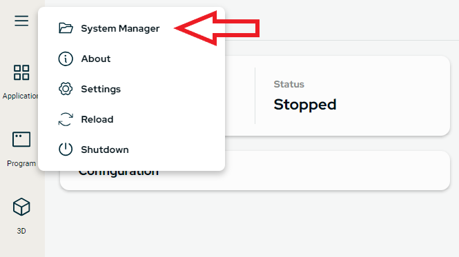
In PolyScope X open the hamburger menu in the upper-left corner and click on System Manager to check the installed URCaps. Your URCap should now be listed here.
Overview of the Project Structure
The following is a simplified way to help you get started with interpreting the project structure that has just been created. Inside your Dev Container the Project should look something like this:
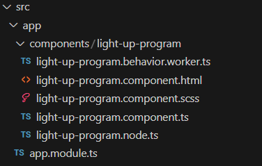
app.module.ts can be seen as the entry point of your URCap. Inside here all URCap Components are declared. In this
case the light-up-program.component.ts is declared. The light-up-program.component.ts is the Angular Component that
is used for the Frontend. Inside this file the behavior of the UI can be defined. An Angular Component always consists
of such a [...].component.ts, which also contains HTML Code and CSS Code. HTML is used to define the Elements that
will be displayed on our UI and with CSS you can define how these HTML Elements should be painted and styled.
Note
At the bottom of this guide you will be able to find the full code for the URCap inside the appropriately named files.
In the case of our autogenerated URCap project, both CSS and HTML are in external
files(light-up-program.component.html and light-up-program.component.scss). The HTML and CSS Code could also be
“in-line” by including these inside the component.ts directly without referencing to these files. For larger HTML
Templates and Style files it is recommended to declare them in their own external files. This should be the standard
setup for your URCaps.
@Component({
    templateUrl: './light-up-program.component.html',
    styleUrls: ['./light-up-program.component.scss'],
    changeDetection: ChangeDetectionStrategy.OnPush,
})

export class LightUpProgramComponent implements OnChanges, ProgramPresenter {
Adding Controls to HTML
The first step will be to add the desired UI elements to our HTML code. In the first step we will not handle any user input. The UI elements needed for this project will be a Slider to choose the time the output should light up for and a dropdown menu to choose the output.
Slider
The Slider in the UR Storybook looks good, however it only allows for selection between 1-100. There is currently no option for selecting a min and max value. Therefore, we will use a standard HTML Component and apply styling so that it looks exactly like the UR Slider. The HTML Code below will render a simple slider with selectable values from 1 to 10 and with steps of 1. Feel free to change these values to your liking.
    <label class="my-slider">
        <input type="range" max="10" min="1" step="1">
    </label>
After inserting the slider in this way you will notice that it does not really fit the theme of PolyScope X. Therefore we will apply correct styling to the slider in the next section.
Styling via SCSS
Styling is applied within the light-up-program.component.scss file. This file is coupled to the HTML Code in
thelight-up-program.component.ts. To Style your HTML Elements either CSS or SCSS are used. SCSS is a CSS preprocessor
that extends regular CSS with features like variables, nesting, and mixins. It helps developers write cleaner, more
organized stylesheets. SCSS files are compiled into standard CSS for use in web development.
We want to add the following styling to the slider.
.my-slider {
    height: 40px;
    padding: var(--spacing-04);
    box-sizing: border-box;
    background-color: var(--color-background-interactive-default);
    border-radius: var(--border-radius-medium);
    border: 1px solid var(--color-border-default);
    display: flex;
    align-items: center;
    justify-content: center;
    input {
      appearance: none;
      cursor: pointer;
    }

    ::-webkit-slider-runnable-track{
      background: var(--color-background-interactive-active);
      height: var(--spacing-01);
      -webkit-appearance: none;
      opacity: .6;
    }

    ::-webkit-slider-thumb{
      height: 22px;
      width: 22px;
      border-radius: var(--border-radius-large);
      background: var(--color-background-level-07);
      border: 1px solid var(--color-border-default);
      -webkit-appearance: none;
      margin: -10px 0 0;
    }
}
Generating a new URCap the default styling should look similar to the following code snippet. Where display: flex
will make sure that the elements are placed next to each other “inline” and align-items: center will make sure all
elements are vertically aligned. The styling for the slider should be inserted within the curly braces of the
.inline-component {}. It can be added anywhere inside but doing so below the
gap: var(--spacing-03); similarly to the following code snippet will apply the correct styling.
.inline-component {
  display: flex;
  align-items: center;
  height: 40px;
  gap: var(--spacing-03);

  .my-slider {
    ...
  }
}
Applying those changes will result in both the slider and the dropdown being rendered next to each other and already looking good. Nonetheless, you will notice a lack of functionality, especially the slider since it does not provide any feedback of its current position. The next section will explore how to add more functionality to the URCap.
Saving the State of the ProgramNode
Saving the State of the Slider
Similar to how the state is saved for the dropdown, the state of the slider is saved as well. One difference is that the
slider does not have a predefined way of showing the current selected value. For that a simple span element is added
to display the value at all times. Again the first step is to bind the properties from HTML to the component class.
<span>Time to Light Up:</span>
<label class="my-slider">
<input type="range" max="10" min="1" step="1" [(ngModel)]="lightUpTime" (change)="afterLevelChange()">
</label>
<span>{{ lightUpTime }}s</span>
The first span element is just to show the user what the slider will do. The second one shows the selected time in
seconds.
The [(ngModel)] directive is a two-way binding in angular. When you use [(ngModel)], changes in the UI automatically
update the corresponding component property, and vice versa.
It combines both one-way binding [] (from component to view) and event binding () (from view to component) into a
single syntax. In this case the lightUpTime property on the component class and on the view component will always be in
sync.
Important
To use the [(ngModel)] directive it is needed to import the Angular FormsModule. This should be done in the app.module.ts.
To add this import it is crucial to understand the functionality of the app.module.ts. The app module is the root
module of your component and bootstraps your components. It contains the following:
Declarations: This section lists the components, directives, and pipes that belong to this module.
Imports: Here, you import other modules that your app depends on. For example, the BrowserModule is essential for running your app in a web browser.
Providers: Is where Services can be injected via dependency injection.
Therefore, we want to add the FormsModule to the Imports section of our AppModule.
// [...]
import { FormsModule } from '@angular/forms'; //import
// [...]
@NgModule({
declarations: [
LightUpProgramComponent
],
imports: [
BrowserModule,
BrowserAnimationsModule,
UIAngularComponentsModule,
HttpClientModule,
FormsModule, //FormsModule for use of TwoWayBinding
TranslateModule.forRoot({
loader: { provide: TranslateLoader, useFactory: httpLoaderFactory, deps: [HttpBackend] },
useDefaultLang: false,
})
],
providers: [],
})
Now, due to the Two-Way Binding every change will update our span element.
As we don’t want to save the parameters with multiple saveNode calls every time the user moves the slider, we utilize
the change() event as well. This will only call our afterLevelChange() method when the user lets go of the pressed
element, thereby selecting the final value.
Next the lightUpTime property needs to be created in the component class:
private outputs = ["DO 0", "DO 1", "DO 2", "DO 3", "DO 4", "DO 5", "DO 6", "DO 7"];
private output : string;
private lightUpTime : number;
constructor(
...
Again add the parameters to both the .node.ts and the .behavior.worker.ts.
import { ProgramNode } from '@universal-robots/contribution-api';
export interface LightUpProgramNode extends ProgramNode {
type: string;
parameters: {
lightUpTime: number;
digitalOutput: number;
};
lockChildren?: boolean;
allowsChildren?: boolean;
}
And:
const createProgramNode = async (): Promise<LightUpProgramNode> => ({
type: 'sample-company-light-up-light-up-program',
version: '1.0.0',
lockChildren: false,
allowsChildren: false,
parameters: {
lightUpTime:1,
digitalOutput:0
},
});
Finally, the called method afterLevelChange() should be created and the Slider initialized in the ngOnChanges()
Method.
afterLevelChange(){
this.contributedNode.parameters.lightUpTime = this.lightUpTime;
this.saveNode();
}
ngOnChanges(changes: SimpleChanges): void {
...
if (changes?.presenterAPI && this.presenterAPI) {
this.output = this.outputs[this.contributedNode.parameters.digitalOutput];
this.lightUpTime = this.contributedNode.parameters.lightUpTime;
}
}
This should result in both the slider and the dropdown menu preserving their state. You might notice a less than ideal
behavior of the span element. This following styling makes certain the span does not wrap upon white spaces and
should be added at the bottom of the inline-component:
.inline-component {
...
span {
padding-right: 0.5rem;
white-space: nowrap;
}
}
This concludes the Section about saving values in an URCap.
Adding URScript Code
Now that the URCap is saving its current state, however on program execution the output does not turn True. This will change by adding URScript Code to the URCap.
Adding ScriptCode to the URCap is done within the light-up-program.behavior.worker.ts. This is the only file needed
for this section. Within this class we have access to the ScriptBuilder(). This ScriptBuilder allows contributing lines
of ScriptCode to the program that will be generated at the position of the URCapNode’s placement within the program
tree.
The code below shows how to add this ScriptBuilder. For this sample we will work with the generateScriptCodeBefore
method. Within the scope of this function we have access to the LightUpProgramNode and therefore to both
parameters, digitalOutput and lightUpTime.
With builder.addStatements() script lines can be added. In this sample URScript Code similar to this should be
generated:
set_standard_digital_out(0, True)
sleep(5)
set_standard_digital_out(0, False)
The values for sleep and the digital_out to light up should be chosen by the saved values in the node.
const generateScriptCodeBefore = async (node: LightUpProgramNode): Promise<ScriptBuilder> => {
const builder = new ScriptBuilder();
builder.addStatements(`set_standard_digital_out(${node.parameters.digitalOutput}, True)`);
builder.sleep(node.parameters.lightUpTime);
builder.addStatements(`set_standard_digital_out(${node.parameters.digitalOutput}, False)`);
return builder;
};
Tip
If this structure looks unfamiliar it might help to look up “Arrow functions in TypeScript”.
Now the correct script code will be executed and the URCap should work.
Adding Validation
It is recommended to require the user to make a conscious decision and force the user to select an Output instead of
predefining one. This is what will be added with a validation step. First we make the digitalOutput parameter optional
by adding a ? to the declaration.
export interface LightUpProgramNode extends ProgramNode {
type: string;
parameters: {
lightUpTime: number;
digitalOutput?: number;
};
lockChildren?: boolean;
allowsChildren?: boolean;
}
Further the predefined value set inside the .behavior.worker.ts needs to be removed. Only the slider will receive a
predefined value now.
const createProgramNode = async (): Promise<LightUpProgramNode> => ({
type: 'sample-company-light-up-light-up-program',
version: '1.0.0',
lockChildren: false,
allowsChildren: false,
parameters: {
lightUpTime:1
},
});
To set the Node to inValid and paint it yellow in PolyScope, the validator needs to be added. This can be done within
the validate function inside the .behavior.worker.ts. With the code below, the parameter will be checked. If it is
not undefined, it will return a ValidationResponse with the isValid property set to true; otherwise, it will return
false.
const validate = async (node: LightUpProgramNode, context: ValidationContext): Promise<ValidationResponse> => ({
isValid: node.parameters.digitalOutput !== undefined
});
Now the component class will also receive an undefined value for digitalOutput. This will cause an unhandled error
without further changes. To catch this case, one option is to check if this value is undefined and react on this case.
To do so change the initialization of the UI inside the component class like this.
if (changes?.presenterAPI && this.presenterAPI) {
this.lightUpTime = this.contributedNode.parameters.lightUpTime;
this.output = this.contributedNode.parameters.digitalOutput !== undefined
? this.outputs[this.contributedNode.parameters.digitalOutput] : "";
}
Now if the value is undefined it will set the output to "". In case the [selectedOption] property on the
ur-dropdown element receives an empty string, it will display the string attached to the placeholder property.
Adding a Dynamic Label to the ProgramNode
The final step to complete a full URCap is to add a label representing the URCap Node’s current state. This allows users to quickly see the actions that will be executed by the node at a glance.
The block of code below will first check whether digitalOutput is defined and depending on that either
displays DO not defined or a combination of the digital out and the time it will light up for.
Depending on if it is one second or multiple seconds, the text changes as well. This is stored in timeUnit.
const createProgramNodeLabel = async (node: LightUpProgramNode): Promise<string> => {
if(node.parameters.digitalOutput !== undefined){
const timeUnit = node.parameters.lightUpTime === 1 ? 'second' : 'seconds';
return `DO ${node.parameters.digitalOutput} for ${node.parameters.lightUpTime} ${timeUnit}`;
}
return `DO not defined`;
};
Success!
Now the LightUp URCap is finished and should work! Now is the time to explore what else is possible with PolyScope X SDK by looking through the different other guides or by exploring the provided samples bundled within the SDK.
CheatSheet
Used inside the SDK Folder to create a new URCap Project.
./newurcap.sh
Install dependencies in URCap Project. Only needed when changing dependencies or upon the first time.
npm install
Run the build process of an URCap. This will generate the URCap as .urcapx file inside the ./target folder. That file can then be installed on a robot.
npm run build
Install URCap remotely via IP&PORT. Can be used to deploy either to a URSim or to a robot in the network.
npm run install-urcap -- --host <HOST_IP> -- --port <PORT>
Used inside the URSim Folder to run the URSim. By default, will launch the URSim with Port 80. With flag –port a different port can be specified.
./run-simulator --port <PORT>
Full Code of URCap
Below you will find the full code of the finalized URCap Project. For the best understanding of the SDK and Structure it is highly recommended to follow the Guide above fully before utilizing this source code.
app.module.ts
import { DoBootstrap, Injector, NgModule } from '@angular/core';
import { LightUpProgramComponent } from './components/light-up-program/light-up-program.component';
import { UIAngularComponentsModule } from '@universal-robots/ui-angular-components';
import { BrowserModule } from '@angular/platform-browser';
import { createCustomElement } from '@angular/elements';
import { HttpBackend, HttpClientModule } from '@angular/common/http';
import { TranslateLoader, TranslateModule } from '@ngx-translate/core';
import { MultiTranslateHttpLoader } from 'ngx-translate-multi-http-loader';
import { PATH } from '../generated/contribution-constants';
import { BrowserAnimationsModule } from "@angular/platform-browser/animations";
import { FormsModule } from '@angular/forms';
export const httpLoaderFactory = (http: HttpBackend) =>
new MultiTranslateHttpLoader(http, [
{ prefix: PATH + '/assets/i18n/', suffix: '.json' },
{ prefix: './ui/assets/i18n/', suffix: '.json' },
]);
@NgModule({
declarations: [
LightUpProgramComponent
],
imports: [
BrowserModule,
BrowserAnimationsModule,
UIAngularComponentsModule,
HttpClientModule,
FormsModule,
TranslateModule.forRoot({
loader: { provide: TranslateLoader, useFactory: httpLoaderFactory, deps: [HttpBackend] },
useDefaultLang: false,
})
],
providers: [],
})
export class AppModule implements DoBootstrap {
constructor(private injector: Injector) {
}
ngDoBootstrap() {
const lightupprogramComponent = createCustomElement(LightUpProgramComponent, {injector: this.injector});
customElements.define('sample-company-light-up-light-up-program', lightupprogramComponent);
}
// This function is never called, because we don't want to actually use the workers, just tell webpack about them
registerWorkersWithWebPack() {
new Worker(new URL('./components/light-up-program/light-up-program.behavior.worker.ts'
/* webpackChunkName: "light-up-program.worker" */, import.meta.url), {
name: 'light-up-program',
type: 'module'
});
}
}
light-up-program.behavior.worker.ts
/// <reference lib="webworker" />
import {
InsertionContext,
ProgramBehaviors,
ProgramNode,
registerProgramBehavior,
ScriptBuilder,
ValidationContext,
ValidationResponse
} from '@universal-robots/contribution-api';
import { LightUpProgramNode } from './light-up-program.node';
// programNodeLabel is required
const createProgramNodeLabel = async (node: LightUpProgramNode): Promise<string> => {
if(node.parameters.digitalOutput !== undefined){
const timeUnit = node.parameters.lightUpTime === 1 ? 'second' : 'seconds';
return `DO ${node.parameters.digitalOutput} for ${node.parameters.lightUpTime} ${timeUnit}`;
}
return `DO not defined`;
};
// factory is required
const createProgramNode = async (): Promise<LightUpProgramNode> => ({
type: 'sample-company-light-up-light-up-program',
version: '1.0.0',
lockChildren: false,
allowsChildren: false,
parameters: {
lightUpTime:1
},
});
// generateCodeBeforeChildren is optional
const generateScriptCodeBefore = async (node: LightUpProgramNode): Promise<ScriptBuilder> => {
const builder = new ScriptBuilder();
builder.addStatements(`set_standard_digital_out(${node.parameters.digitalOutput}, True)`);
builder.sleep(node.parameters.lightUpTime);
builder.addStatements(`set_standard_digital_out(${node.parameters.digitalOutput}, False)`);
return builder;
};
// generateCodeAfterChildren is optional
const generateScriptCodeAfter = async (node: LightUpProgramNode): Promise<ScriptBuilder> => new ScriptBuilder();
// generateCodePreamble is optional
const generatePreambleScriptCode = async (node: LightUpProgramNode): Promise<ScriptBuilder> => new ScriptBuilder();
// validator is optional
const validate = async (node: LightUpProgramNode, context: ValidationContext): Promise<ValidationResponse> => ({
isValid: node.parameters.digitalOutput !== undefined
});
// allowsChild is optional
const allowChildInsert = async (parent: ProgramNode, childType: string): Promise<boolean> => true;
// allowedInContext is optional
const allowedInsert = async (context: InsertionContext): Promise<boolean> => true;
// upgradeNode is optional
const nodeUpgrade = (loadedNode: ProgramNode): ProgramNode => loadedNode;
const behaviors: ProgramBehaviors = {
programNodeLabel: createProgramNodeLabel,
factory: createProgramNode,
generateCodeBeforeChildren: generateScriptCodeBefore,
generateCodeAfterChildren: generateScriptCodeAfter,
generateCodePreamble: generatePreambleScriptCode,
validator: validate,
allowsChild: allowChildInsert,
allowedInContext: allowedInsert,
upgradeNode: nodeUpgrade
};
registerProgramBehavior(behaviors);
light-up-program.component.ts
import { ChangeDetectionStrategy, ChangeDetectorRef, Component, Input, OnChanges, SimpleChanges } from '@angular/core';
import { TranslateService } from '@ngx-translate/core';
import { ProgramPresenter, ProgramPresenterAPI, RobotSettings } from '@universal-robots/contribution-api';
import { LightUpProgramNode } from './light-up-program.node';
import { first } from 'rxjs/operators';
@Component({
templateUrl: './light-up-program.component.html',
styleUrls: ['./light-up-program.component.scss'],
changeDetection: ChangeDetectionStrategy.OnPush,
})
export class LightUpProgramComponent implements OnChanges, ProgramPresenter {
// presenterAPI is optional
@Input() presenterAPI: ProgramPresenterAPI;
// robotSettings is optional
@Input() robotSettings: RobotSettings;
private _contributedNode: LightUpProgramNode;
//CHANGED
private lightUpTime : number;
private outputs = ["DO 0", "DO 1", "DO 2", "DO 3", "DO 4", "DO 5", "DO 6", "DO 7"];
private output : string;
constructor(
protected readonly translateService: TranslateService,
protected readonly cd: ChangeDetectorRef
) {
}
// contributedNode is optional
get contributedNode(): LightUpProgramNode {
return this._contributedNode;
}
@Input()
set contributedNode(value: LightUpProgramNode) {
this._contributedNode = value;
this.cd.detectChanges();
}
ngOnChanges(changes: SimpleChanges): void {
if (changes?.robotSettings) {
if (!changes?.robotSettings?.currentValue) {
return;
}
if (changes?.robotSettings?.isFirstChange()) {
if (changes?.robotSettings?.currentValue) {
this.translateService.use(changes?.robotSettings?.currentValue?.language);
}
this.translateService.setDefaultLang('en');
}
this.translateService
.use(changes?.robotSettings?.currentValue?.language)
.pipe(first())
.subscribe(() => {
this.cd.detectChanges();
});
}
if (changes?.presenterAPI && this.presenterAPI) {
this.lightUpTime = this.contributedNode.parameters.lightUpTime;
this.output = this.contributedNode.parameters.digitalOutput !== undefined
? this.outputs[this.contributedNode.parameters.digitalOutput] : "";
}
}
//CHANGED
afterLevelChange(){
this.contributedNode.parameters.lightUpTime = this.lightUpTime;
this.saveNode();
}
selectionChange($event){
this.contributedNode.parameters.digitalOutput = this.outputs.indexOf($event);
this.saveNode();
}
// call saveNode to save node parameters
async saveNode() {
this.cd.detectChanges();
await this.presenterAPI.programNodeService.updateNode(this.contributedNode);
}
}
light-up-program.node.ts
import { ProgramNode } from '@universal-robots/contribution-api';
export interface LightUpProgramNode extends ProgramNode {
type: string;
parameters: {
lightUpTime: number;
digitalOutput?: number;
};
lockChildren?: boolean;
allowsChildren?: boolean;
}
light-up-program.component.html
<div *ngIf="contributedNode" class="inline-component">
<span>Time to Light Up:</span>
<label class="my-slider">
<input type="range" max="10" min="1" step="1" [(ngModel)]="lightUpTime" (change)="afterLevelChange()">
</label>
<span>{{ lightUpTime }}s</span>
    <ur-dropdown
        [options]="outputs"
        [label]="'Digital Output'"
        [placeholder]="'- Select -'"
        [selectedOption]="output"
        (selectionChange)="selectionChange($event)"
    ></ur-dropdown>
</div>
light-up-program.component.scss
@import '../../../styles.scss';

.inline-component {
  display: flex;
  align-items: center;
  height: 40px;
  gap: var(--spacing-03);

  .my-slider {
    height: 40px;
    padding: var(--spacing-04);
    box-sizing: border-box;
    background-color: var(--color-background-interactive-default);
    border-radius: var(--border-radius-medium);
    border: 1px solid var(--color-border-default);
    display: flex;
    align-items: center;
    justify-content: center;
    input {
      appearance: none;
      cursor: pointer;
    }

    ::-webkit-slider-runnable-track{
      background: var(--color-background-interactive-active);
      height: var(--spacing-01);
      -webkit-appearance: none;
      opacity: .6;
    }

    ::-webkit-slider-thumb{
      height: 22px;
      width: 22px;
      border-radius: var(--border-radius-large);
      background: var(--color-background-level-07);
      border: 1px solid var(--color-border-default);
      -webkit-appearance: none;
      margin: -10px 0 0;
    }
  }
  span {
    padding-right: 0.5rem;
    white-space: nowrap;
  }
}